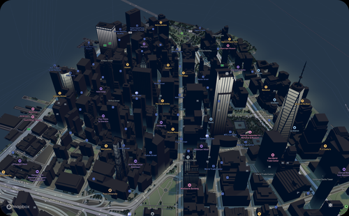
Earlier this month, real-time location intelligence company Mapbox announced their new Mapbox Standard core style, which brings new 3D capabilities to their platform. The new style is currently available in a public beta, and in a blog post the company says it “enhances wayfinding and spatial orientation for users, and provides a polished canvas for custom location data.” The new Mapbox Standard style is available in the latest versions of both their web and mobile SDKs.
The new standard style includes a number of improvements and additions to the platform, all designed to provide users with more context and give developers more flexibility, but without taking away from the important locations already being portrayed on a map.
Dynamic lighting
The first new feature Mapbox discusses is a new dynamic lighting feature, which both improves a user’s experience while also making developer workflows more efficient. In the new Mapbox Standard, there are four lighting presets: Day, night, dusk, and dawn. From the user’s perspective, this lighting changes automatically throughout the day to match how lighting changes in the real world, with shadows shifting. At night, supplementary light sources like flood lights and entrance lights enhance the map. Meanwhile, developers no longer need to program a transition between day and night manually, as the style reacts to real-time lighting conditions for a given area.
Adding 3D landmarks
In addition to the dynamic lighting, the new Mapbox Standard is also adding 3D representations of landmarks from around the world. They indicate that the initial dataset will include “hundreds of famous and recognizable landmarks across the globe,” and that they will be adding more each month. They will also respond dynamically to the lighting changes discussed above. On top of simply making the map better to look at, by adding these 3D representations of the most famous buildings users can have a better idea of where they may be – or may be going – in a new city by orientating themselves relative to the most recognizable locations.
Maintaining emphasis on location information and flexibility
Amid these efforts to add more three-dimensional context to maps and make the experience more realistic for users, Mapbox is also emphasizing that they are not moving from their core ideas of flexibility and focusing on location information. With the addition of 3D landmarks and less detailed footprints for other buildings, they are still trying to keep their maps simplistic and maintain the focus on location information.
From the aforementioned blog post, they say, “The result is an aesthetically pleasing map where elements like landmarks, buildings, roads, and trees are clearly identifiable yet still abstract enough to make the map highly readable and not distract from icons, labels, and custom location data.”
Additionally, they want to assure developers that these new 3D elements will not affect performance of their maps. They note that it can be a trade-off between the aesthetics of 3D versus the performance of 2D, but they claim to solve this by “integrating elegant styling for both 2D and 3D views, with a smooth and seamless transition between the two.”
★★★
We know that it’s easier to contextualize scenes when it’s represented in three dimensions as opposed to two, and Mapbox is playing into that reality while working to not sacrifice the simplicity and performance 2D maps can provide. But even for simply navigating through a city, this update can make things easier. For example, in New York City a tourist may have a better idea of how to get to a restaurant or storefront based on where it is relative to the Empire State Building, which will now stand out now only in the physical world but also within the map.
The company calls out specific industries which can add value with the new Mapbox Standard core style as well, including spaces like travel planning, real estate, and fitness, among others. Developers are able to explore the new core style here.


